FlowCraft Scroll-Spy Contents
Scroll through the sample "Our process" page below. The contents highlights the step you're reading, and clicking a step glides straight to it. This demo runs the same app.js that comes with the paid component.
Sample content. The five-step agency process and its illustrations are placeholders for your own pages, and nothing you enter here is saved or sent.
Try it
- Scroll the page. The contents stays in view and highlights the step you're reading.
- Click a step. The page scrolls smoothly and stops just below the header.
- Watch the progress. On a wide screen, the sidebar shows how much of the page has been read.
Step 1 · Week 1
Discovery

Every project starts with a conversation. Before we sketch a single page, we want to understand your business: who you serve, what makes you different, and what you need your website to do. Is it bringing in enquiries, taking bookings, selling products, or simply giving people confidence when they look you up?
We'll ask about your current site, what works and what doesn't, and look at a few sites you like and dislike. Those examples tell us more about your taste in ten minutes than a long questionnaire ever could.
We also talk practicalities early: your budget range, your deadline, who will approve the work, and who will update the site once it's live. Getting these on the table now avoids awkward surprises later.
By the end of discovery, we both know whether we're a good fit. If we are, you'll receive a written proposal with the scope, timeline and fixed price, so you can decide with all the facts in front of you.
- A 45-minute discovery call
- A short review of your current website
- A written proposal with scope, timeline and fixed price
Step 2 · Weeks 1–2
Strategy & sitemap
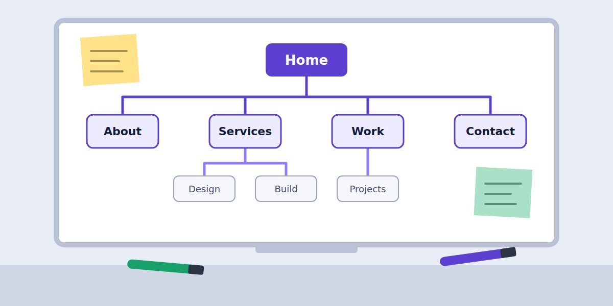
Next, we plan the structure. A sitemap is simply a map of every page and how they connect. It sounds basic, but it's where most of the important decisions happen: what visitors need to find first, which services deserve their own page, and where every "Get in touch" button should lead.
We look at how your customers actually search, the questions they ask before buying, and the pages your competitors rank for. That tells us which pages to create and what each one needs to say.
For each page we outline its purpose, the main message and the single action we want a visitor to take. If you're writing your own copy, this outline becomes your brief; if we're writing it, it's what we'll share for your input.
You'll review and approve the sitemap before any design starts. Changing a box on a whiteboard takes a minute; changing a finished page takes a day.
- A sitemap of every page
- A content outline for each page
- A list of keywords each page should cover
Step 3 · Weeks 2–4
Design

With the plan approved, we design the look and feel. We start with your brand: logo, colours and fonts. If you don't have a full brand yet, we'll put together a simple style guide so everything feels consistent.
We design the homepage first, on desktop and on a phone, because it sets the tone for everything else. You'll see a realistic mockup with your real content where possible, not grey boxes and placeholder text.
Once the homepage feels right, we design the remaining page types: service pages, the portfolio, the contact page and any special layouts. Most sites need four to six distinct templates; the rest reuse them.
You'll get two rounds of revisions on the designs. We'll walk you through each one on a call and explain the reasoning behind the choices, so feedback is quick and specific.
- A simple style guide: colours, fonts, buttons
- Desktop and mobile designs for every page type
- Two rounds of revisions
Step 4 · Weeks 4–6
Build
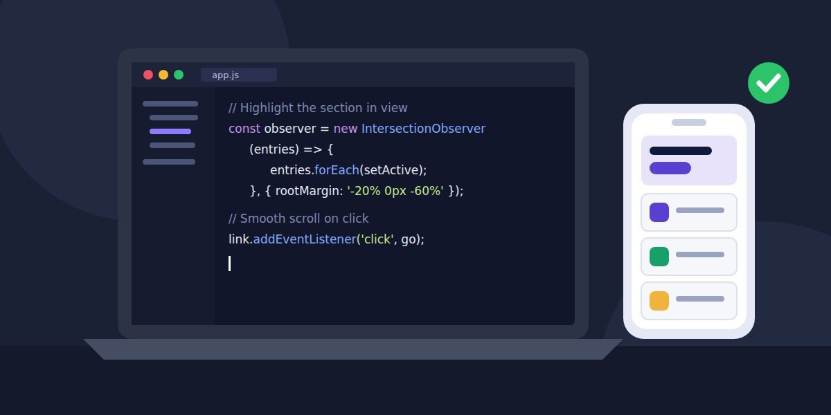
Now the designs become a working website. We build on a private preview link, so you can click through the real site on your own phone and laptop while it takes shape.
Every page is built to work on any screen size, load quickly and be readable by search engines and screen readers. Forms are connected to your inbox, and tools like booking calendars or maps are set up and tested.
We add your content as we go. If some text or photos are still on their way, we'll keep a simple checklist so nothing is forgotten and nothing holds up the rest of the build.
Before launch, you'll get a short walkthrough of how to edit your own pages, plus a written guide to keep. Updating your opening hours or adding a new project shouldn't need a developer.
- A private preview link to review the site
- Forms, maps and booking tools connected and tested
- A walkthrough and written guide for editing your pages
Step 5 · Week 6 and beyond
Launch & care
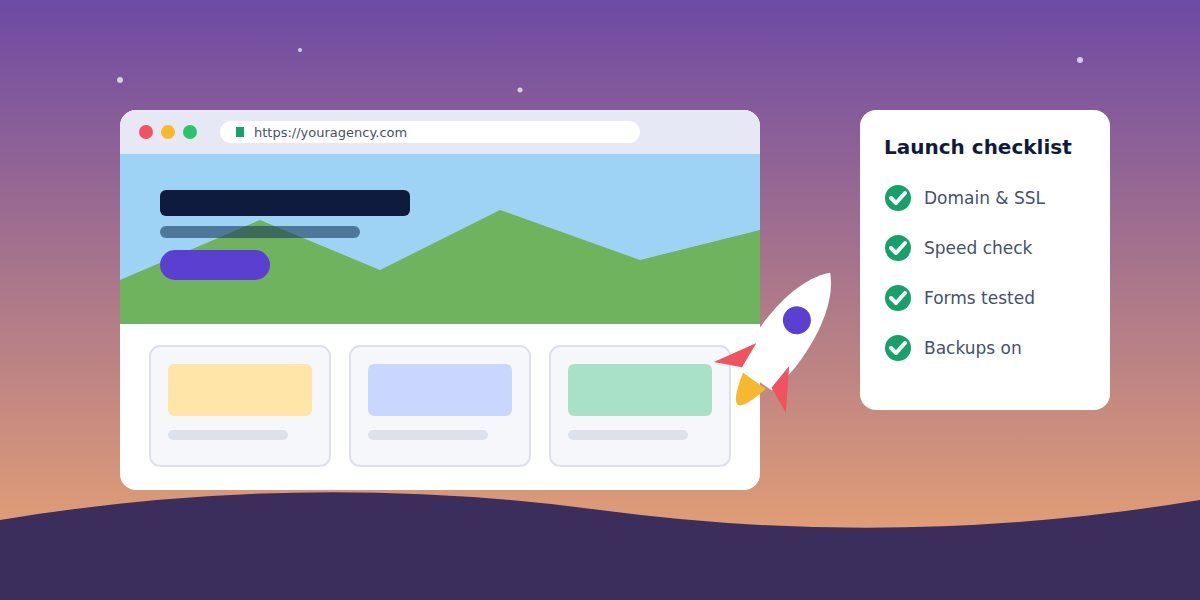
Launch day is calm when the checklist is done. We connect your domain, switch on the security certificate, set up redirects from your old pages so existing links keep working, and test every form one last time.
We submit your sitemap to Google, connect analytics if you'd like it, and check the site on a range of real devices and browsers.
For the first 30 days after launch, any bugs are fixed at no cost. After that, you can take the site from there, or choose a care plan where we handle updates, backups and small content changes each month.
Either way, you own your website and everything in it. We'll hand over every login and file, so you're never locked in.
- Domain, security certificate and redirects set up
- 30 days of free bug fixes
- Every login and file handed over to you
Ready to start your project?
Leave your email and we'll reply with a few questions and a free quote. No obligation.
A reading line, watched by the browser
Instead of checking positions on every scroll, app.js asks the browser's built-in IntersectionObserver to report when a section crosses a thin "reading line" near the top of the screen. Every step is explained in comments.
- Section crosses the lineThe line sits a quarter of the way down, just below the header. Whichever section it passes through is the one being read.
- Link highlightedYour own Tailwind classes are added to that link, and screen readers are told it's the current location.
- Click to glideA click scrolls smoothly to the section, stopping below your sticky header, then moves keyboard focus to its heading.
Lead context: when a reader asks for a quote, the form sends their email with the steps they reached and how much of the page they read, for example sectionsRead: ["Discovery", "Design"].
<nav data-toc
  data-active-class="border-indigo-600
    text-indigo-700 font-semibold">
  <a data-toc-link href="#pricing">Pricing</a>
</nav>

<section id="pricing" data-spy-section
class="scroll-mt-24">…</section>href matches a section's id. scroll-mt-24 sets how far below the top a section stops, so your sticky header never covers the heading. Add as many sections as you like.What the full version includes
Delivered as a ZIP download through Payhip.
-
index.htmlSticky contents, five sample sections and the quote form, styled with Tailwind CSS -
app.jsScroll-spy, smooth scrolling, reading progress and the quote form, heavily commented -
style.cssLink transitions, progress bar and the swipeable pill bar on phones -
assets/images/Five sample section illustrations, plusREADME.txtand an optional.htaccess
Requirements
- Any web host, or none. The page also works when
index.htmlis opened directly from your computer. - Your own content. Replace the five sample sections, or add as many as you need. Each needs an
idand a matching link. - A form endpoint to receive leads (optional). Any service that accepts a JSON
POST, for example Formspree, Make or Zapier. Until you add one, the quote form sends nothing and says so. - An internet connection for visitors. Tailwind CSS loads from its public CDN. No npm install or build step.
Get the Scroll-Spy Contents
Start with the free static shell to check the layout, or get the full version with the working contents you just tried.
Free
Free Static HTML Shell
The page layout: sticky sidebar, pill bar, five sample sections with images and the quote form, so you can review the design and markup.
- Complete visual layout with sample images
- Links jump to sections (the browser's plain jump)
- Does not include the highlighting, smooth scroll or form logic
Opens the free download on Payhip.
Full version
Full Scroll-Spy Contents — $47
The working component you just tried, ready for your own long pages.
- Highlights the section being read, using IntersectionObserver
- Smooth scrolling that stops below your sticky header
- Sticky sidebar on desktop, swipeable pill bar on phones, reading progress
- Quote form sends each reader's email and the steps they read to your form service
Checkout and download are handled by Payhip.
Back to the FlowCraft catalogue to see the other components.